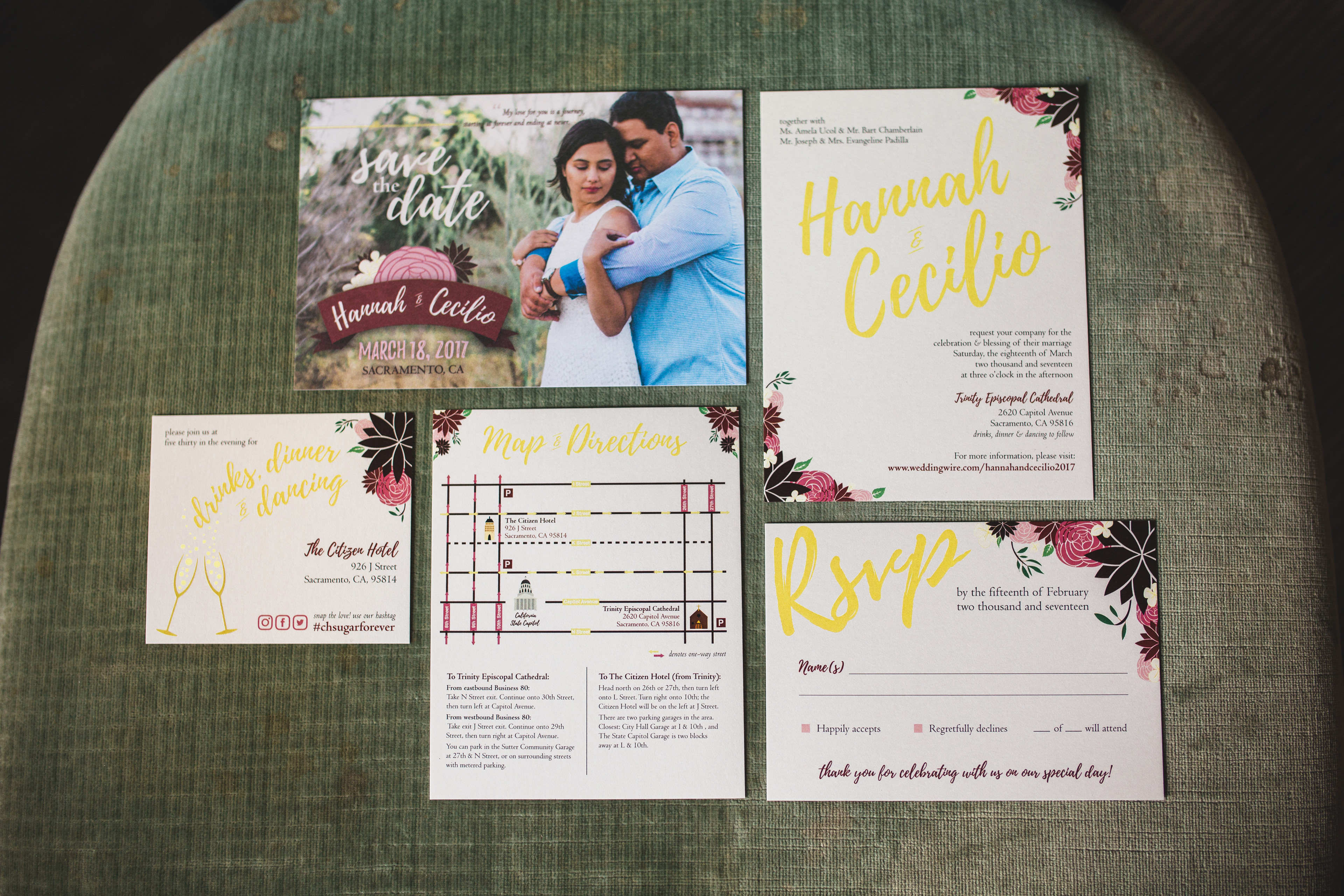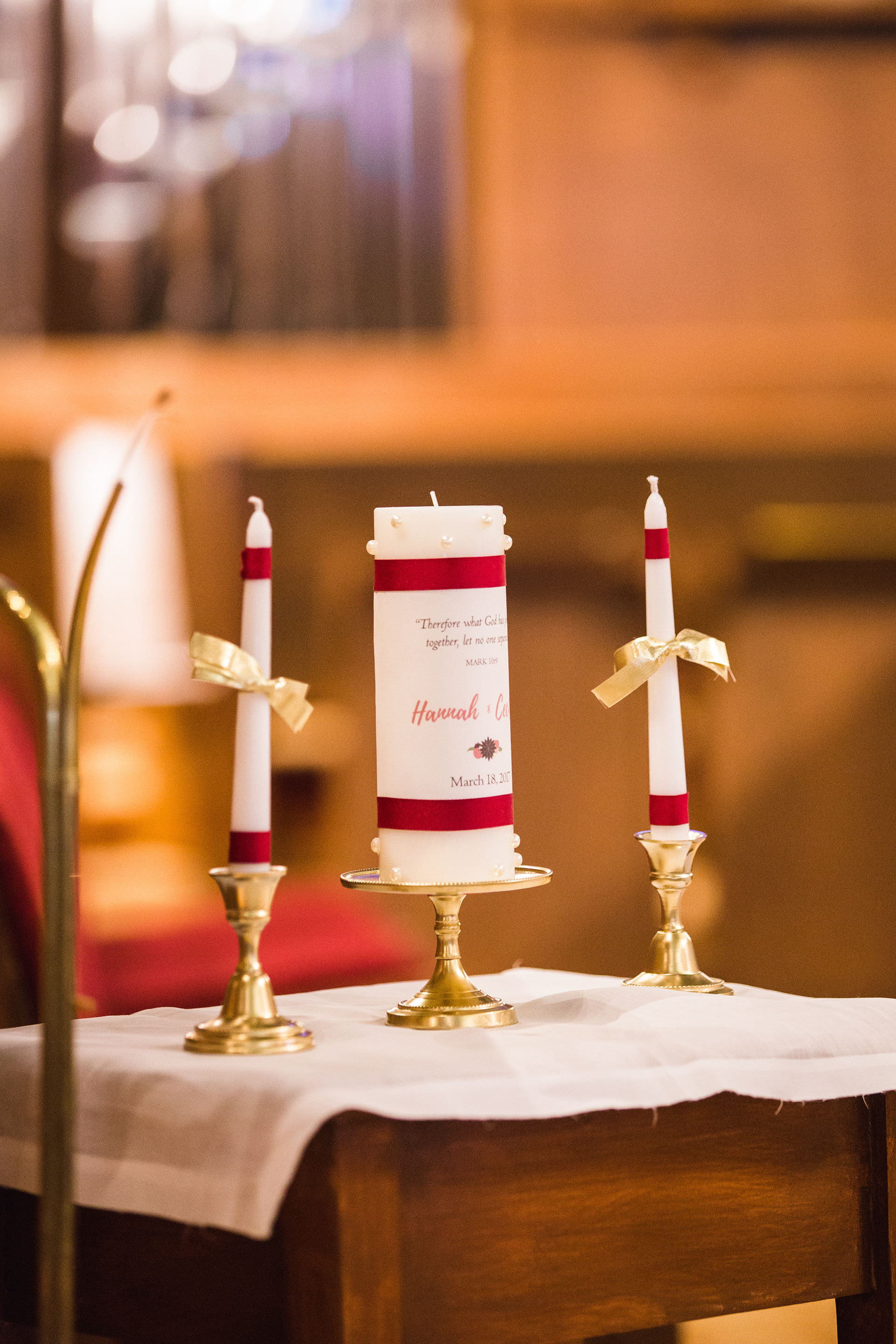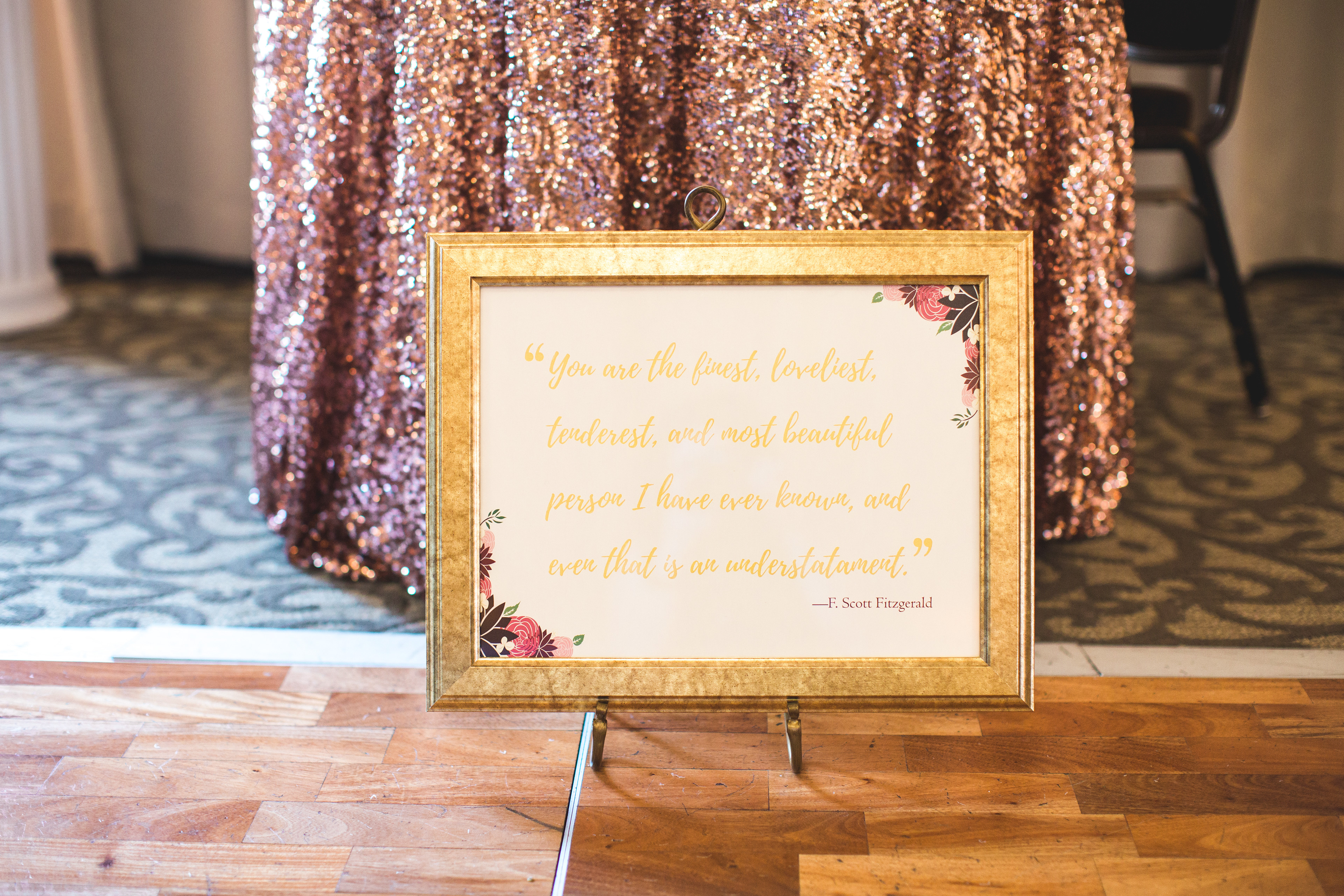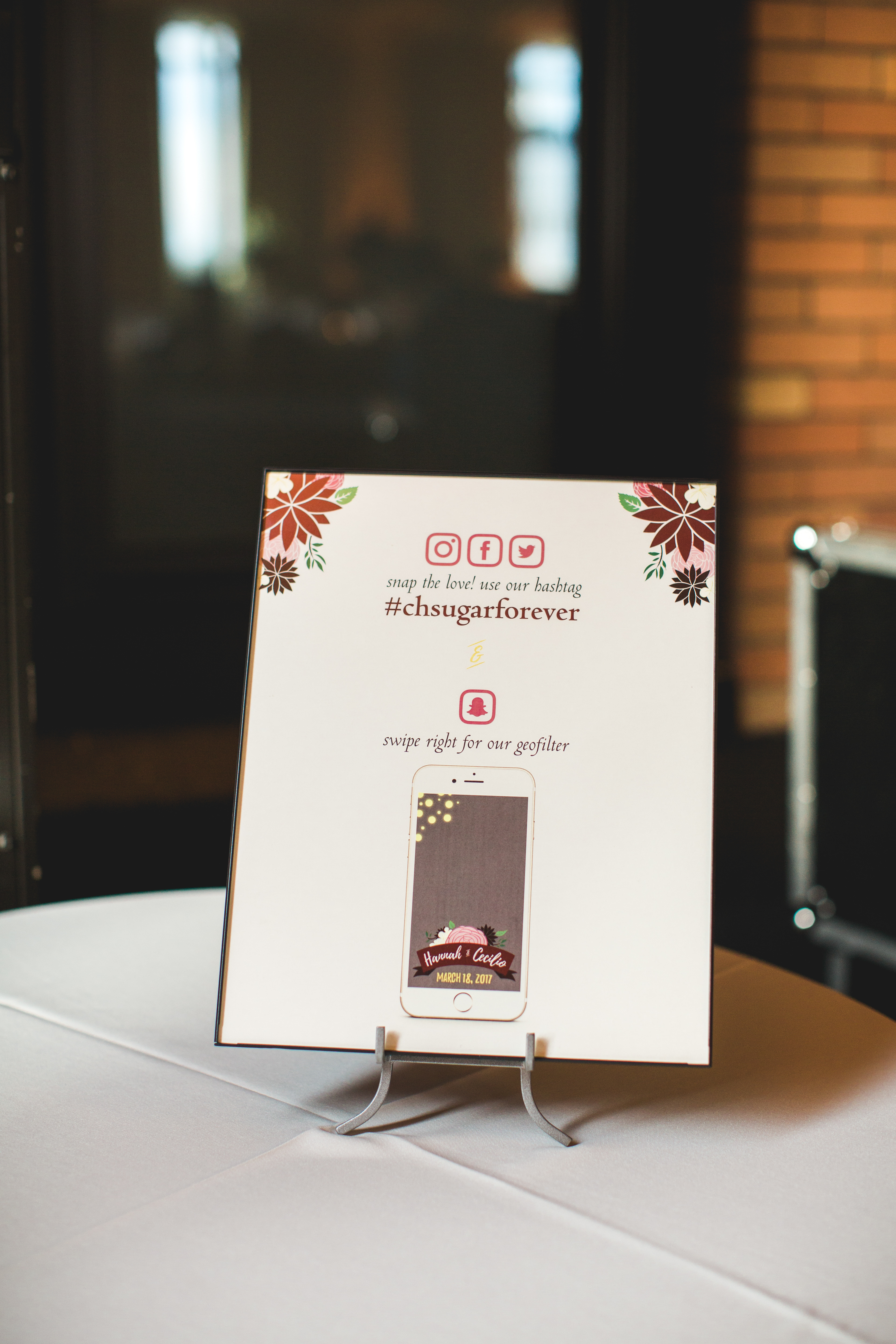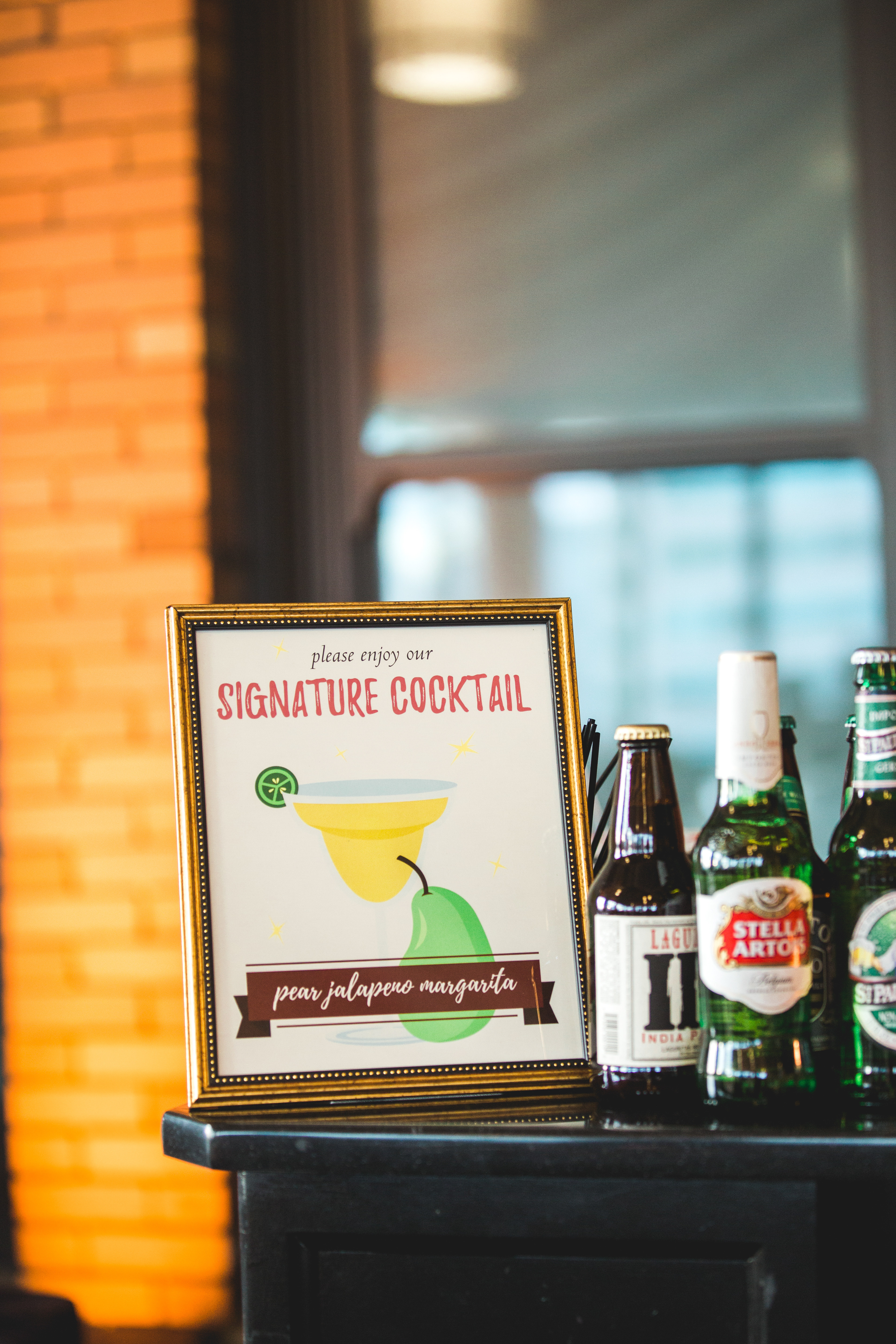
During the beginning of my wedding planning process, I was drawn to rich, jewel-toned colors. I decided to have our colors as burgundy, blush pink, gold and cream. A part of it was because of how the colors fit perfectly within the ceremony (stain-glassed Episcopal Church) and reception (eclectic retro meets modern themed hotel) sites. I meshed the rich, dramatic color scheme with whimsical elements and illustrations, which are incorporated in the invitations and the wedding reception signage. This reflects my husband and my playful personality. To encourage guests to have a great time and share the memories and experiences through social media, I have designed a Snapchat geofilter for the reception.
Photo Credit: Elisabeth Arin Photography